
Amey Barapatre
CS 424 Projects Page
Don’t Go Near The Water :
Scroll to See More.
How-Tos :
Click here for the Visualization
The sidebar is used to navigate through various visualization. Each Visualization has an appropriate title according to the data it represents. Look below for details on the data. The line graph of the cholera attacks is interactive and allows you to pan zoom and see the data point nearest to the pointer. The tables are also interactive and allow the user to sort the data according to their choice of column. One of the visualizations are the geographical mappings of number of fatalaties in the 1851 cholera out break. The map widgets show the original John Snow’s map and the modern day map. Clicking on any of the circles on the maps shows a popup of number of fatalities that it represents. Click multiple times to rotate through the popups of the overlapping circles.
About the Data:
The data is about the 1854 London cholera outbreak based on data created and compiled by Robin Wilson .I also use number of deaths per 10,000 inhabitants for men and women in different age groups from cholera in the same time period in naples and the UK census data for 1851 to have a base line for analysis. The data about Naples in the Time of Cholera 1884-1911 is from Cambridge University.The locations of fatalities and pumps from Robin Wilson’s data were used to georeference John Snows map by using the QGIS tools. Refer WALKERKE and QGIS documentation for details.
Steps to Deployment:
- clone https://github.com/ameybarapatre/Cholera-Outbreak-Data-Analysis or download the zip.
- Install R studio.
- Install all the depedencies called in ‘library()’ using install.packages command.
- Ensure you have an internet connection as it uses custom tiles from my server.
- Run the app.R script.
- To deploy use the publish button but you have to create a shinyapps.io account first.
Inferences from the Data:
About the Cholera Attack of 1854 :
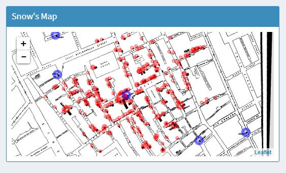
The Broad Street pump had the infected water, because it was right at the center of most deaths. Though it was not the closest pump for some to their home, they might have drunk water from it when in the area
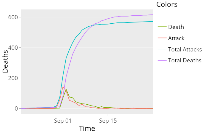
September 7, 1854 the day when John Snow removed the pump handle, the line graphs show a sharp decline in the number of attacks after September 7. The number of fatal cholera attacks had diminished from 142 on September 1st, to 14 on September 8th, the day on which the pump was closed.
About Cholera in 19th Century:
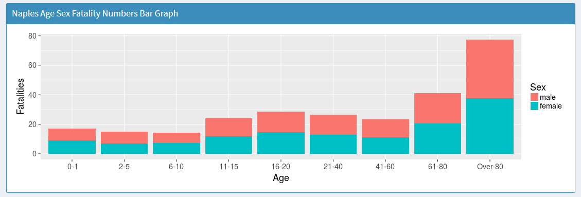
As seen from the naples fatality table .Infants arent affected as their diet is mainly breast feeding. Fatality rate increases at elder age both for men and women
About the Census Data:
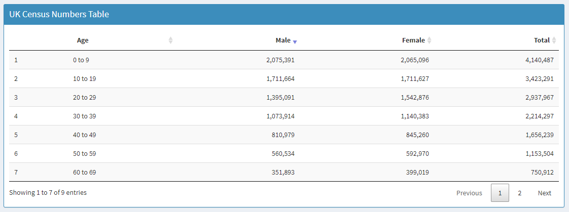
Evident that sex ratio was good and life expectancy wasn’t from the graphs and the piecharts.