
Amey Barapatre
CS 424 Projects Page
Mass Shootings
Gun violence has been a much debated topic in the United States for this decade mostly because of the mass shootings. Although they make up for a small portion of the gun related violence it garners the most attention as the victims are randomly targeted at the most mundane of places. Schools were thought to be the least likeliest of these places, but in 1999 it all changed , the seige by two seniors at Columbine High School in Colorado became a turning point after which school shootings could no longer be considered unthinkable aberrations. After a confused response that played out over several hours while a wounded teacher bled to death, U.S. law enforcement agencies overhauled procedures and officer training to create protocols for stopping “active shooters”.
This visualization by the Washington Post wants its readers to question if theres a bigger pattern with mass shootings, are just the school shootings that are the deadliest ? is it the most targeted place? is it a gun control problem?.
Victim’s Silhouttes:
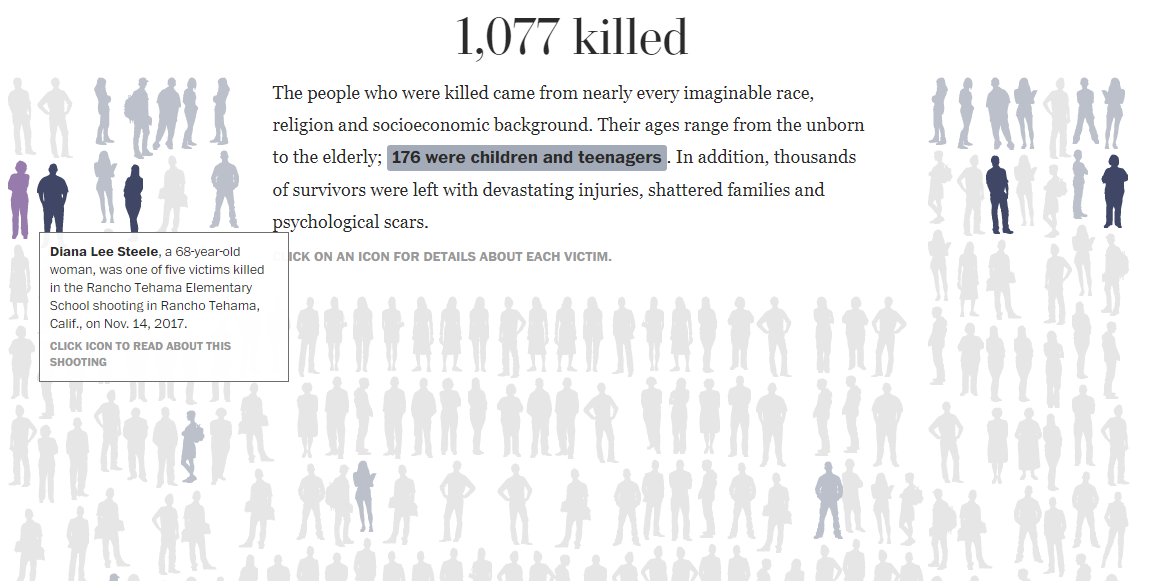
The visualization encodes the data for two categories viz. victims under 18 and above 18 with colors. Children are highlighted with the same color the text has been higlighted. This quickly shows that there have been more adult victims than children. Hovering on the victim shows all the other victims of the incident.
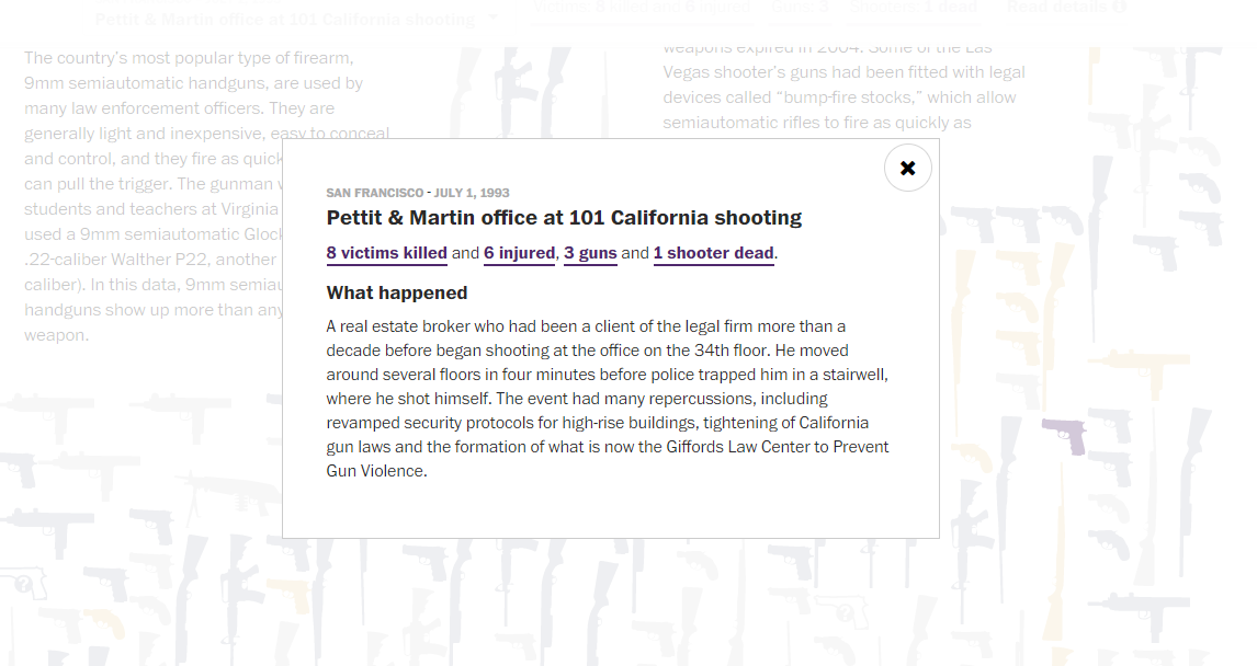
Clicking on the victim shows the details of the shooting, the sub heading of this pop up shows the key facts of the incident, the number of people injured , deaths , guns and the number of shooters.
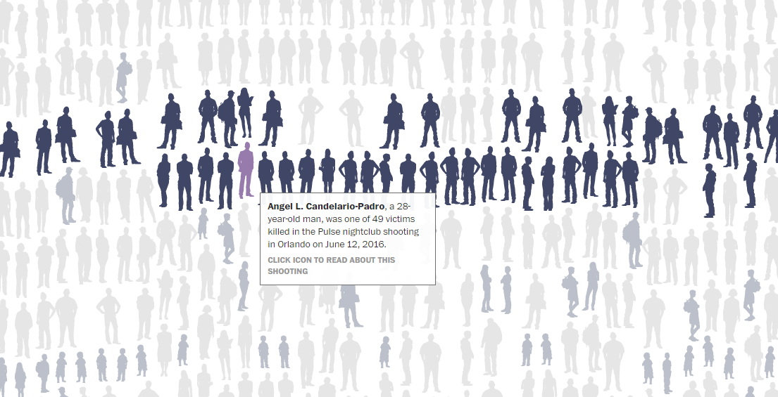
These silhouttes through out the visualization are ordered chronologically bottom to top which is a good feature.But, the distribution of the silhouttes involved in the same shooting makes it hard to keep track when you take the pointer off the silhoutte.
Guns Silhouttes:
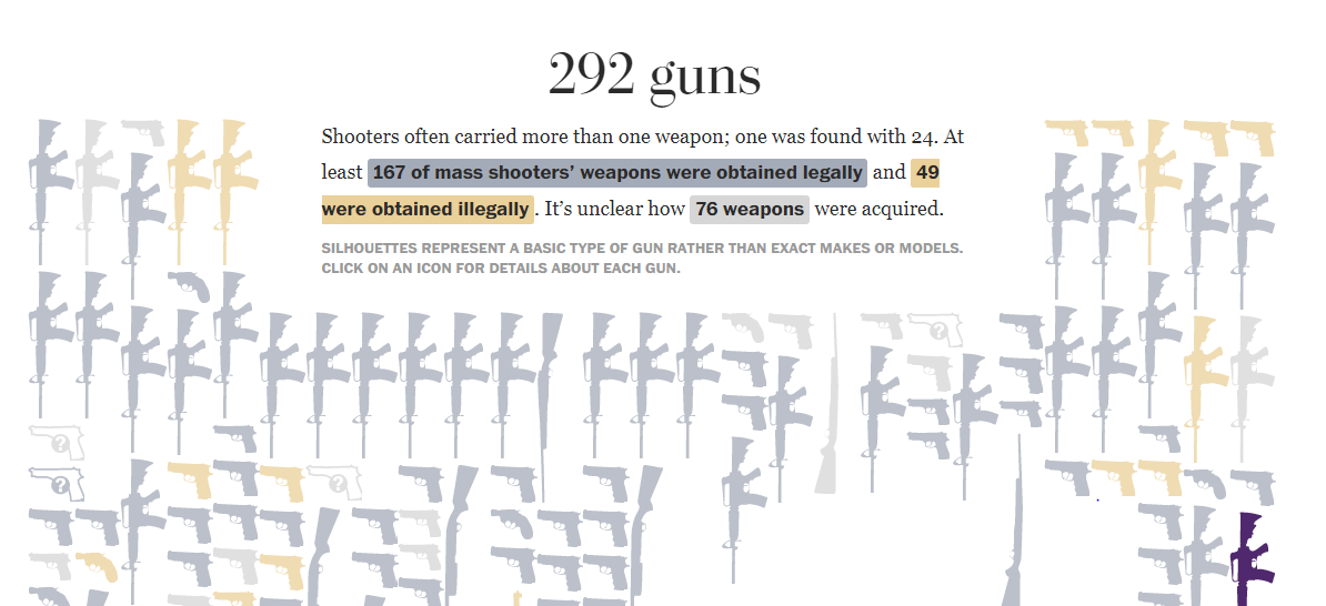
The guns have also been encoded according the highlights on the texts, illegally obtained, legally obtained and unclear origins. Also, where the gun type is unknown it is marked with a questionmark. The reason for this specific categorization shows that the amount of legally obtained guns is much larger than the illegally obtained ones. The popups and the hovering features continue with the gun silhouttes. The interesting thing that comes out of the visualization is that the number of hand guns used is significantly more than the semi-automatic or automatic rifles. Which draws the question is it sufficient to just put stricter laws on bigger guns. Although I concede that it will be a good starting point.
The stastistic that could be a part of this visualization is the total number victims associated with each type of gun which would make it clear which weapon is more deadly.
Shooter Silhouttes:
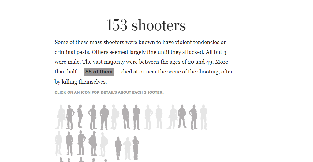
This visualization follows suit with the popups , the coloring indicates if the shooter died in the incident. There are no conclusive findings apparent from this visualization. Making the point that there are no specific traits to any shooter other than the fact that almost all of them are male. A deeper perspective is required to make comments in regards of the gender of the shooter.
The Timeline:
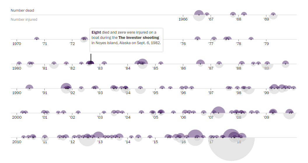
This visualization makes the frequency and deadliness of the shootings clear from a temporal perspective. Showing how the shootings have been increasing in the past decade and have been getting deadlier with time. Smaller patches, of high frequency of shootings coincide with tougher times like the increase in unemployment rate in early 90s. A bigger causality/correlation is pointed out in the article.
The AR-15, a lightweight, customizable version of the military’s M16, soared in popularity after a 10-year federal ban on assault weapons expired in 2004.
It’s either causation or just plain correlation that the frequency increases dramatically soon after 2004. A contributing factor might be the economic depression that followed 2004.
The Map:
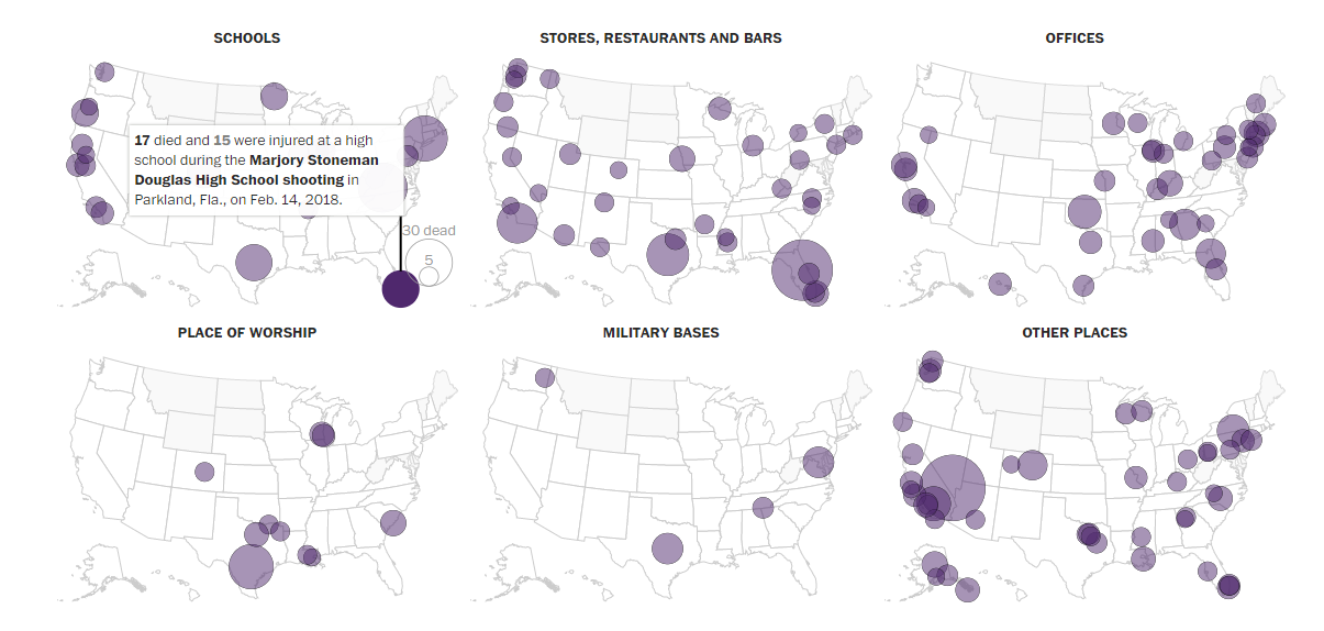
The map doesn’t have popups but information for the incident shows up on hover. The color encoding is abandoned in this visualization so is the gun information. Given categorization perspective according to type of the location it is a useful visualization and makes it’s point that schools aren’t the most likely targets on contrary of public opinion neither are they they most deadliest. From a geospatial perspective it is doesn’t fulfill the purpose, since more valuable information like severity of state gun laws could have been encoded along with the type and the number of the guns involved.
Data:
This data is compiled from Mother Jones; Grant Duwe, author of “Mass Murder in the United States: A History,” and Washington Post research. It starts from Aug. 1, 1966 and goes through 2018. The article chooses a narrow definition of mass shooting considering the ones with 4 or more victims.
Death tolls include victims killed by shooters within a day of the main shooting, including any who were killed in another way. Totals also include people who later died from injuries received during the shootings. A gun purchase that should have been rejected but was allowed because of a bureaucratic or reporting glitch is considered illegal. Reports disagree on some ages in this dataset.
Additional sources: Violence Policy Center, Gun Violence Archive; FBI 2014 Study of Active Shooter Incidents; published reports.